


Identifying over prescribed chemicals: a data-driven approach to mining prescription data
- Posted:
- Written by:
-
- Lisa Hopcroft
- Categories:

One of our key aims at Bennett Institute for Applied Data Science is to develop novel data-driven approaches to interpret our health care data. We want to use data science to identify patterns in the data that afford us a new, unbiased perspective on how well the NHS is working and how it could be better.
This week sees the publication of a new paper from our group that describes one approach to identifying unusual patterns of prescribing in the NHS. This work uses a national dataset (available to browse via our OpenPrescribing website) which captures NHS primary care prescribing behaviour in England. This dataset contains counts of all drugs, in all NHS practices, in each month. Data at that resolution can be quite messy and difficult to make sense of, but with the right approaches we can harness that variability and start to tease out signals from the noise.
Unusual prescribing behaviour ≠ poorer care
First, a caveat: unusual prescribing does not imply a poorer standard of care. The needs of one patient population will be different to another’s, and differences in prescribing could well be the result of considered clinical opinion and be warranted. As such, the results discussed here, and described in more detail in our publication, are presented simply as an observation for people in the know to follow up on.
How do you decide what is “unusual”?
An important benefit of having access to national datasets is that we can characterise how all organisations vary within a population: does it look like GPs prescribe drug X at similar rates? Or are some practices clear outliers, prescribing drug X at much higher or lower rates? Identifying where behaviour is unusual presents us with opportunities to improve the health service: what could be better and where? Or, equally as important, where have improvements already been realised and how has that been achieved?
How do you identify outliers?
To analyse prescribing data, the raw prescription counts are first “normalised” using appropriate denominators: we re-express the data as “chemical-class” values, which describe what proportion of all drugs of a particular class are for one particular drug (e.g., what proportion of “Oral iron” prescriptions contain “Ferrous Fumarate”). As we are interested in looking at how rates vary across Clinical Commissioning Groups (CCGs), these proportions were calculated for each of the 207 CCGs in the dataset. With these prescribing rates calculated, we can set about identifying the outliers.
Our approach in this particular project was to first generate a list of candidate drugs that looked likely to contain high-prescribing outliers and then apply two ranking approaches to identify the most extreme outliers amongst those candidates.
We started with a list of 1511 chemicals that could be prescribed. This list was filtered to remove any chemicals where prescribing rates were seen to be stable across CCGs (“low variability”); any outliers were likely to be low-prescribers (“negative skew”); absolute prescribing numbers were low (“low volume”); the average rate of prescribing was quite high (“high average rate”). This last filtering step was included because we wanted to focus on chemicals that were generally prescribed at very low levels (if at all).
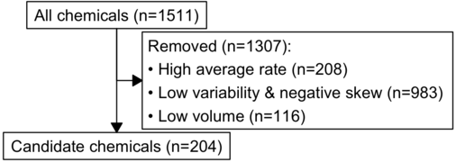
This left us with 204 chemicals of interest. For each of these chemicals, we calculated two metrics: (1) a ratio of the very highest prescribers to more moderate prescribers (the high:mid centile ratio) and (2) kurtosis, roughly a measure of how much of your data occurs at the extreme ends of your distribution. We used these metrics to rank out candidates to focus on those chemicals that are the most extreme outliers.
So what did you find?
Each of our 204 candidate chemicals are shown on the plot below, plotted by the two outlier metrics. The top 5 results for each measurement are highlighted in orange.
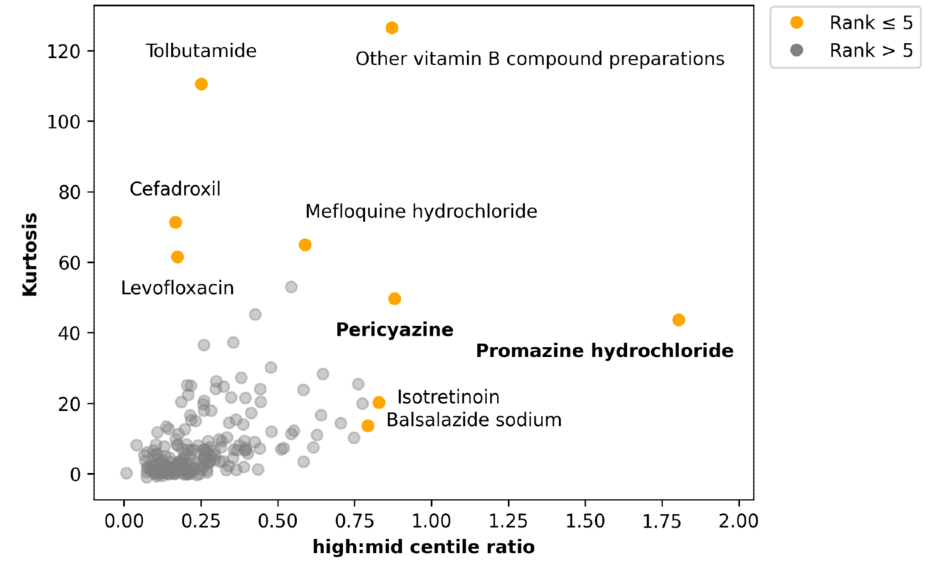
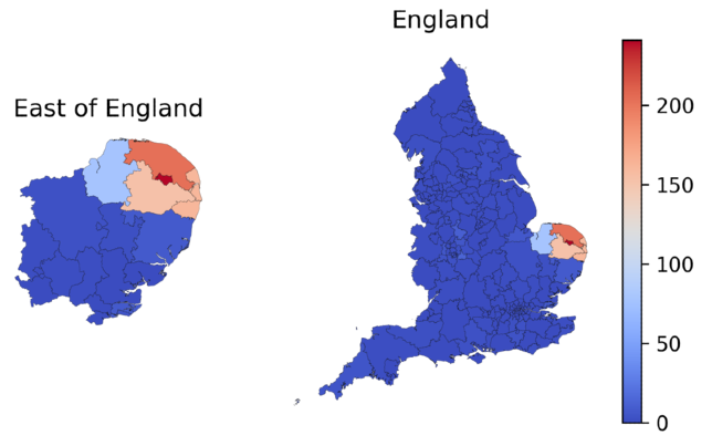
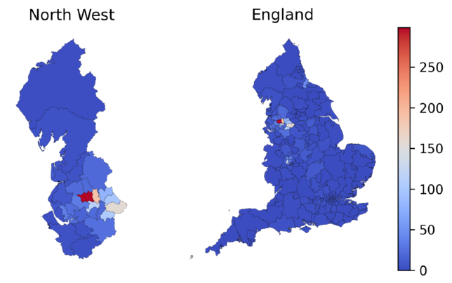
Two relatively rare antipsychotics—pericyazine and promazine hydrochloride—stood out to our clinical staff (they are highlighted in bold in the plot above). We investigated this a little further to find out where these outliers were occuring, and we found that the higher prescribing rates were clustered geographically. The rate of pericyazine prescribing was 7.6 times higher in the East of England than it was nationally; similarly, the rate of promazine hydrochloride prescribing was 4.4 times higher in the North West of England than it was nationally. There were even more pronounced differences in specific CCGs. The maps below demonstrate the geographic clustering of these chemicals: the colour scale in each plot indicates the number of prescriptions per 1000 antipsychotic prescriptions in the corresponding geographic region.
What next?
It wasn’t just pericyazine and promazine hydrochloride that looked to be interesting outliers: a couple of antibiotics (levofloxacin and cefadroxil) have been surfaced too. These could be interesting candidates to investigate in more detail.
More widely, we are always looking to expand our tool box with regards to analysing variability in healthcare data. This is just one of several different algorithms at various stages of development and testing that we are looking to deploy on OpenPrescribing, to help healthcare providers to prioritise and focus manual clinical audit and review.