


Identifying outlier prescribing behaviour: how is your practice unusual?
- Posted:
- Written by:
-
- Lisa Hopcroft
- Categories:

We’re excited to introduce a new interactive tool to help users identify instances of unusual or “outlier” prescribing. Navigate to your favourite CCG, PCN, STP or practice and find out what they’re prescribing more (or less) than everyone else. We are very keen for feedback, so please do get in touch if this helps you identify any unusual prescribing. You can do this by completing a survey, emailing us at bennett@phc.ox.ac.uk or even tweeting us at @OpenPrescribing. In this blog, Lisa sets out more detail about how this new tool works. You can also watch a demonstration of the tool on our YouTube channel.
Introducing our outlier prescribing dashboards
There is substantial variation in prescribing rates amongst NHS organisations, across various different areas of medicine. Some variation can be explained by demographic changes, or local policies or guidelines, but much of the remaining variation is less easy to explain. At OpenPrescribing we are piloting a number of data-driven approaches that enable the identification of unusual prescribing and support prescribers and organisations to audit and review their prescribing behaviour.
Our intention with this work was to automatically identify patterns of prescribing that are furthest away from “typical” prescribing. The brilliant thing about using a complete, national dataset is that we don’t have to reach a consensus about what “typical” prescribing looks like, nor do we need to decide what “furthest away” means: we can work it out from the data using measures like the mean and standard deviation.
It’s important to remember that this process is entirely automated and that it is very possible that some of this “outlier” behaviour is a reasoned decision, made by a healthcare professional. As such, we intend that these dashboards are interpreted by expert users, with the appropriate local knowledge. We hope that our approach will expose other patterns that reveal an opportunity to make improvements and help GPs prescribe more safely, more effectively and more cost-effectively, as shown in our previous research.
How does it work?
We calculate the number of prescriptions for each chemical in the BNF coding system and use the count for the relevant BNF subparagraph as a denominator to calculate a ratio. We then calculate the mean and standard deviation for these rates across all the organisations (the organisations could be practices, CCGs, PCNs or STPs, we calculate results for them all). From this we can calculate the “Z-score”, which is a measure of how many standard deviations a given organisation is from the population mean. We then rank the Z-scores to find the top ten results where prescribing is an outlier for prescribing higher than its peers and the top ten results where it is an outlier for prescribing lower than its peers. All the code is openly available for inspection and re-use on Github.
Can you show me an example?
See below a screenshot of the Cumbria And North East STP dashboard (huge thanks to Ewan Maule and Andrew Brown from Sunderland CCG for input on this blog). The first table lists the top ten chemicals that are prescribed at higher rates here compared to other STPs; the second table lists the top ten chemicals that are prescribed at lower rates here compared to other STPs.
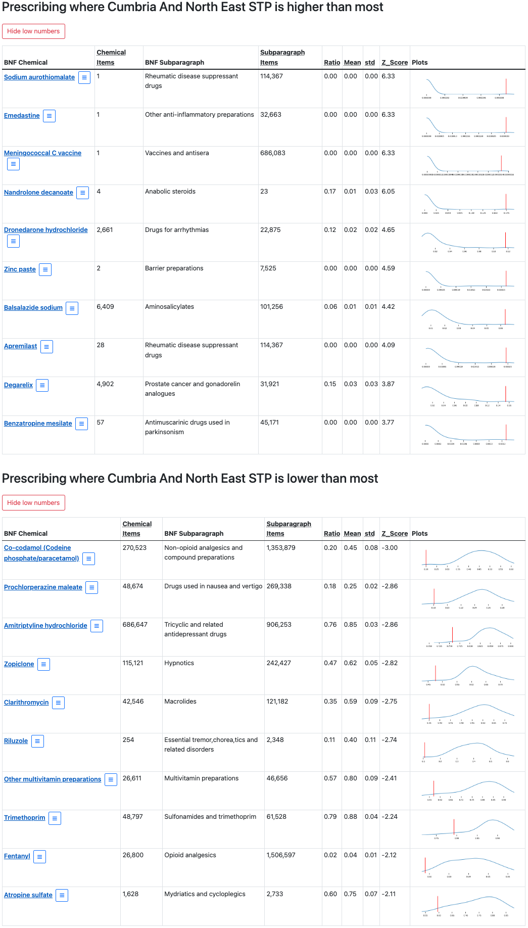
What do all the numbers mean?
The screenshot below zooms in on one of these chemicals in the “lower than most” table: Co-codamol (Codeine phosphate/paracetamol).
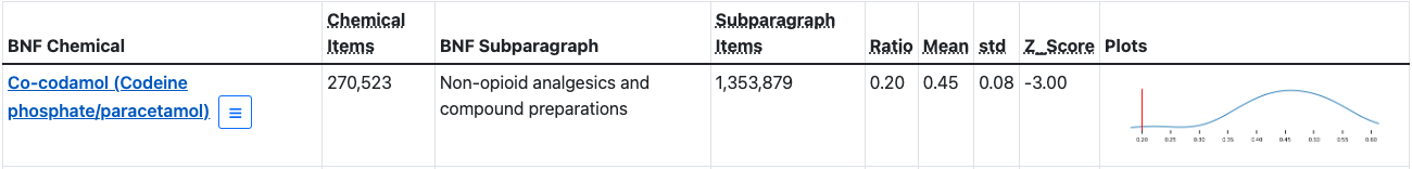
This tells us that, in this STP, there have been 270,523 prescribed items containing co-codamol (Chemical Items); that co-codamol belongs to the “Non-opioid analgesics and compound preparations” BNF Subparagraph; and that there have been 1,353,879 prescriptions from this subparagraph (Subparagraph Items). The last four columns give us the information we need to assess to what extent the prescribing rates in this STP are unusual. The Ratio tells us what proportion of “Non-opioid analgesics and compound preparations” prescriptions contained co-codamol. This number will be between 0 and 1, where 0 indicates that none of the prescriptions in this group contain co-codamol and 1 indicates that all of the prescriptions in this group contain co-codamol. In this case, we can see that 0.20 (or 20%) of prescriptions from this group contain co-codamol.
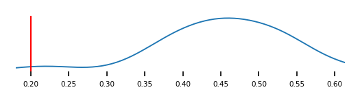
So, is this number typical? Are prescribing rates for co-codamol in this STP higher or lower than expected, compared to other STPs? The Mean and standard deviation (std) columns summarise this same ratio across all STPs; here, the mean is 0.45 and the standard deviation is 0.08. We can then re-express this ratio as a Z-score, which describes the ratio for one STP in the context of all ratios observed, and 0.20 is converted to a Z-score of -3.00. The plots in the last column of the table provide a visual representation of this same information: the distribution of ratios across all STPs is captured by the blue line, while the ratio for this STP is indicated by a vertical red line.
Hover over any of the column titles for a reminder of what the column contains and click on the plots to view a larger version. Sometimes extreme outliers are generated when counts are very low, so we have also given users the option to show or hide low numbers via buttons above each table.
What does this tell me about what’s happening in the real world?
Let’s have a closer look at another one of those “lower than most” results. Amitriptyline hydrochloride is prescribed at lower rates in this STP compared to its peers: its Z-score is -2.86 and we can see that the red line occurs at the lower or left tail of the distribution. But what does that mean, in the real world?

It could mean that levels of prescribing of amitriptyline are genuinely low in this STP. However, these seemingly “low rates” could be due to higher rates of other medications in the same class as Amitriptyline (and in fact we have seen elsewhere in OpenPrescribing that this STP has higher rates of Trazodone prescription. Or, perhaps there are different prescribing arrangements in this STP where secondary care takes more responsibility for prescribing this medicine. The short answer is that we don’t know, but we hope that by identifying these unusual patterns of prescribing behaviour, our tool can prompt further discussion around local safety, effectiveness and cost-effectiveness issues.
How can I find the results for my practice?
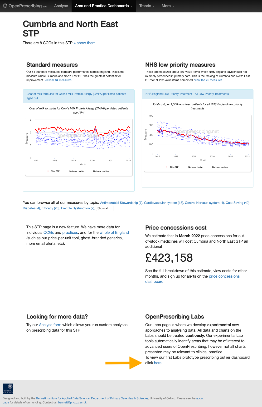
You can navigate to these dashboards directly from your organisation’s landing page on OpenPrescribing. Sticking with the same example, you will find a link to the Cumbria And North East STP dashboard in the “OpenPrescribing Labs” section of the Cumbria and North East STP landing page (indicated by an orange arrow in the image below).
Alternatively, there is an index page that compiles all the dashboards into one place. The dashboards are organised hierarchically, with smaller organisations listed under their parent organisation (for example, practices are listed under their PCN or CCG, and CCGs are listed under their STP). To find the results for a particular practice, you would first expand its parent STP and then its parent CCG (if the practice belonged to a PCN, you would also have to expand that PCN). Expandable organisations are displayed in a bar, with a drop down arrow to the far right; these organisations can be expanded by clicking anywhere in that bar. The link to an organisation’s dashboard is indicated by a right facing arrow (→).
For example, let’s say that you’re interested in the outliers in a particular practice: Pembroke Medical Group. From the main dashboard page, we can expand this practice’s parent organisations by clicking on the bars highlighted in purple below (specifically, E54000037: Devon STP > 15N: NHS Devon CCG > U55399: Baywide PCN). Each expansion will reveal all child organisations of the parent organisation. This will eventually reveal our practice of interest (L83131: Pembroke Medical Group→, highlighted by the green box).
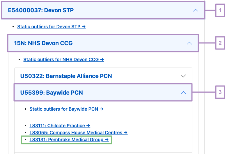
Dashboards have been created for all levels of practice organisation: STP, CCG, PCN as well as practice. Dashboards for the parent organisations in the example above are available via “Static outlier” links ending with a “→” (for example, Static outliers for Devon STP→).
What’s next for this project?
We are excited to release this prototype version out into the wild, but we are especially keen to continue to develop it in line with how our users interact with it. Is there something you’d like to see added to these dashboards? Would an alternative visualisation help you interpret the results? Is there a way that you’d like to interact with the dashboards? For example, user feedback that we have received so far has initiated work on an organisational search functionality that will make it easier for users to find their organisation of interest. Requests from our intended users will allow us to focus our tool development over the coming months and help us provide the most useful tool that we can.
So do let us know what you think (detailed AND short feedback is welcome!). You can do this by completing this survey, emailing us at bennett@phc.ox.ac.uk (just remember to not include any identifiable patient information) or tweeting us @OpenPrescribing.